Teaching Surveys to Visualizations: Build a Trustworthy Dataset in Grades 9-10 (Level 1): Oklahoma Standard L1.DA.CVT.01
Teaching Surveys to Visualizations: Build a Trustworthy Dataset in Grades 9-10 (Level 1): Oklahoma Standard L1.DA.CVT.01
Teaching data collection and visualization in grades 9-10 (level 1) does not have to be complicated. Picture a student council designing a fair lunch-preference survey and visualizing the results in a bar chart. That kind of thinking is exactly what Oklahoma's grades 9-10 (level 1) computer science standard L1.DA.CVT.01 asks students to practice — and it is very teachable with the right materials. This post walks through what the standard means, the misconceptions students bring to it, and discussion starters you can use tomorrow, whether you teach in a classroom or at your kitchen table.
What Does Standard L1.DA.CVT.01 Actually Ask?
Use tools and techniques to locate, collect, and create visualizations of small and largescale data sets (e.g., paper surveys and online data sets). — Oklahoma Academic Standards for Computer Science (February 2023)
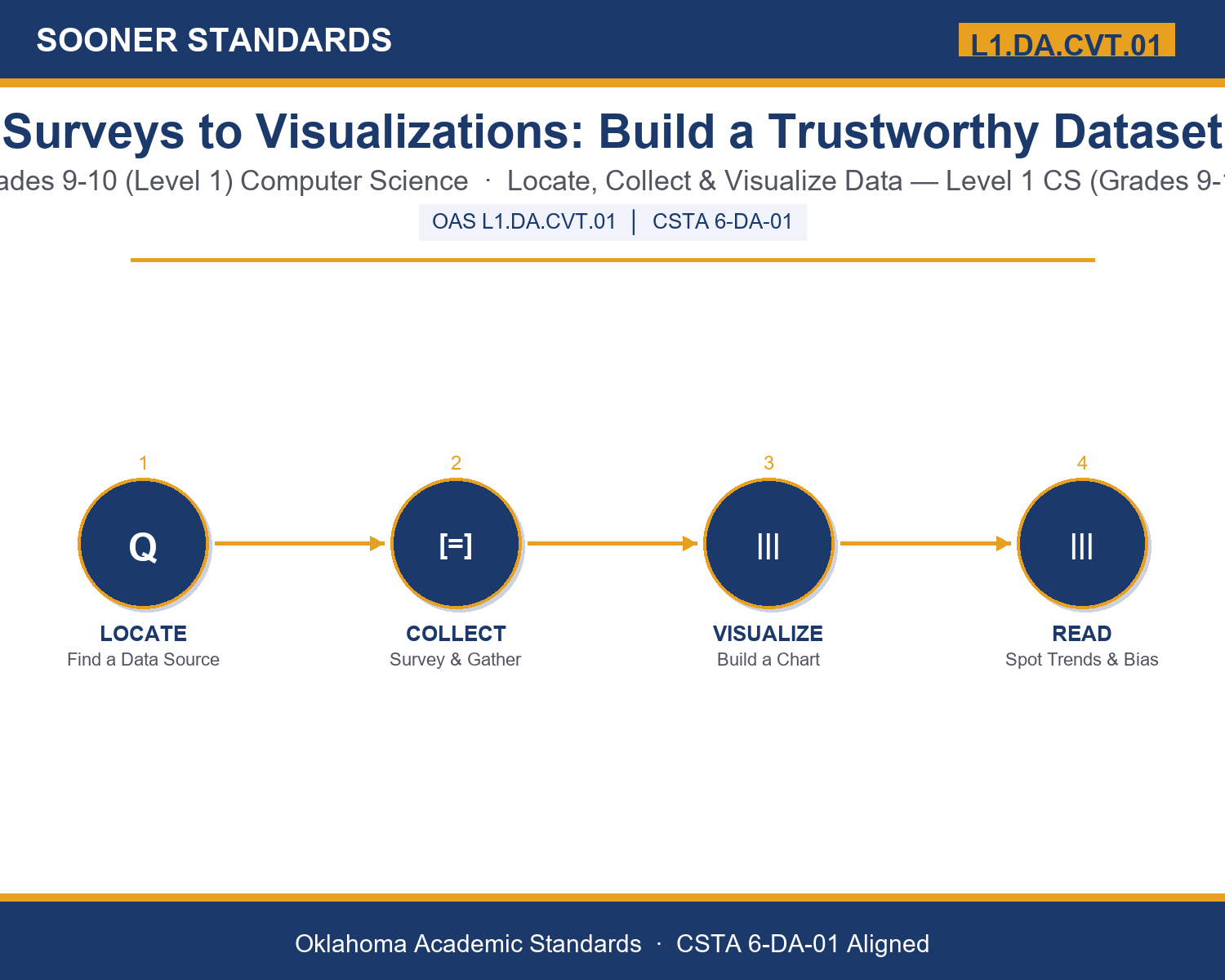
In plain language: This standard asks Level 1 students (grades 9-10) to use tools and techniques to find existing datasets or collect new ones — through paper surveys or online sources — and to turn that data into a clear visualization such as a chart or graph.
In student-friendly terms, the learning target is: "I can use tools and techniques to locate, collect, and create visualizations of small- and large-scale data sets, and explain how my choices affect whether the results can be trusted."
What Students Should Be Able to Do
- I can decide whether a question calls for locating an existing dataset or collecting new small-scale data.
- I can write a survey question that avoids wording bias and choose a sample that fairly represents a population.
- I can classify a variable as qualitative or quantitative and choose a visualization type that matches it.
- I can identify a trend or outlier in a visualization and explain what it does and does not prove.
Along the way, students pick up the working vocabulary of the topic: dataset, survey, variable, sample, bias, visualization, histogram, scatterplot, outlier, trend, spreadsheet, qualitative, quantitative, metadata.
Data Collection And Visualization: Misconceptions to Watch For
These are the wrong turns students reliably take with this standard — knowing them ahead of time is half the lesson plan. Each correction strategy below comes straight from the unit's teacher guide (the paragraph and activity references point into the unit itself).
1. "A bigger sample is always automatically a better sample."
Return to paragraph 3. A sample must represent the population fairly, not just be large — a large but poorly chosen sample can still be biased and untrustworthy.
2. "An outlier in a dataset should always be deleted so it does not distort the chart."
Point back to paragraph 7. An outlier deserves investigation, not automatic removal; it might reveal a data entry error, or it might reveal a genuinely important case worth understanding.
3. "Any chart type can represent any kind of data as long as the numbers are correct."
Emphasize paragraph 6's comparison of histograms, scatterplots, and bar charts. The chart type must match whether the variable is qualitative or quantitative, or the visualization can mislead a reader even with correct numbers.
4. "If a scatterplot shows two variables rising together, one must be causing the other."
Revisit paragraph 7's discussion of trend versus causation. A visible relationship in a scatterplot does not by itself prove that one variable causes the other.
Discussion Starters You Can Use Tomorrow
- Think of a chart or graph you have seen recently. What question do you think the person who made it was trying to answer?
- Why might a company choose to collect its own small-scale survey data instead of relying only on an existing large-scale dataset?
- Describe a survey question that sounds neutral but could still introduce bias depending on who is asked or how it is distributed.
Bringing It Home
This topic is a natural one for families. One ten-minute activity to try: Together, pick a simple question about your family's habits — favorite meals, screen time, or how chores get split up. Write one fair survey question about it, ask everyone in the household, and sketch a simple chart of the results together. Talk about whether the chart type you chose (bars for categories, a different shape for numbers) fits the kind of answer you collected.
Where This Leads
Students who can use tools and techniques to locate, collect, and create visualizations of small- and large-scale data sets, and explain how my choices affect whether the results can be trusted are building skills used every day in data analysis, market research, public health research, and UX research.
See the Unit in Action
Get the Complete L1.DA.CVT.01 Unit
I built a complete, no-prep unit for this standard — From Surveys to Data Visualizations: Locating, Collecting, and Displaying Data — covering 3-4 days of instruction across 43 pages:
- Teacher guide — day-by-day pacing, misconceptions to watch for, discussion questions, differentiation for support / ELL / extension, and a 4-point rubric
- Student learning target page — a kid-friendly "I can" statement with success criteria
- Full content lesson with 3 embedded "Check Your Understanding" checkpoints
- 12-question assessment (6 multiple choice, 4 true/false, 2 short answer) with a complete answer key, explanations, and exemplar responses
- Group activity — "Survey to Story: Build a Visualization from Scratch" (25-30 minutes)
- Individual activity — "My Data Investigation Log" (20 minutes)
- Crossword and word search built from all 14 vocabulary terms (with answer keys)
- Family connection letter — a plain-language page for parents, with dinner-table questions and a 10-minute home activity
- Certificate of achievement — ready to sign and send home
- Data Collection Scenario Cards: Survey to Story (separate printable, 2 pages)
- Reference Sheet: Choosing and Building a Visualization (separate printable, 2 pages)
- My Data Investigation Log (separate printable, 2 pages)
Get Surveys to Visualizations: Build a Trustworthy Dataset on Teachers Pay Teachers →
Also aligned to CSTA 6-DA-01: Use data to highlight or propose cause-and-effect relationships, predict outcomes, or communicate ideas.
Every Sooner Standards resource is built directly from the official Oklahoma Academic Standards for Computer Science (February 2023) — standard text verified, never paraphrased from memory.