Teaching Creating Multiple Representations of Data in Grade 6: Oklahoma Standard 6.DA.S.01
Teaching Creating Multiple Representations of Data in Grade 6: Oklahoma Standard 6.DA.S.01
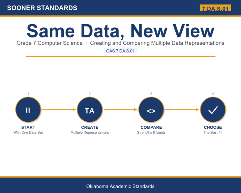
Teaching creating multiple representations of data in grade 6 does not have to be complicated. Picture a data visualization specialist choosing the best chart type for a company report. That kind of thinking is exactly what Oklahoma's grade 6 computer science standard 6.DA.S.01 asks students to practice — and it is very teachable with the right materials. This post walks through what the standard means, the misconceptions students bring to it, and discussion starters you can use tomorrow, whether you teach in a classroom or at your kitchen table.
What Does Standard 6.DA.S.01 Actually Ask?
Create multiple representations of the same data. — Oklahoma Academic Standards for Computer Science (February 2023)
In plain language: Oklahoma's standard asks sixth graders to create multiple representations, such as a table, bar graph, line graph, or pictograph, of the same set of data, and to understand how each format highlights something different.
In student-friendly terms, the learning target is: "I can create multiple representations, such as a table, bar graph, line graph, or pictograph, of the same data set."
What Students Should Be Able to Do
- I can build an accurate table, bar graph, line graph, or pictograph from a dataset.
- I can include a title, labels, and a consistent scale on every representation I create.
- I can explain what each representation type highlights about the data.
- I can choose the representation that best fits a specific question or audience.
Along the way, students pick up the working vocabulary of the topic: data, representation, graph, table, frequency, category, axis, scale, pictograph, label, interpret, trend.
Creating Multiple Representations Of Data: Misconceptions to Watch For
These are the wrong turns students reliably take with this standard — knowing them ahead of time is half the lesson plan. Each correction strategy below comes straight from the unit's teacher guide (the paragraph and activity references point into the unit itself).
1. "A bar graph and a line graph are interchangeable for any kind of data."
Use the comparison chart — bar graphs compare distinct categories; line graphs show trends over a continuous sequence like time. Walk through the rainfall example in paragraph 6 to show how the same data calls for different representations depending on the question.
2. "More decoration (colors, borders, clip art) makes a graph better."
Reference paragraph 7's principle of keeping representations clean and uncluttered — decoration that doesn't explain the data can distract from it rather than help.
3. "A pictograph with a fractional symbol (like half an apple) is confusing or 'wrong.'"
Clarify from paragraph 5 that a half-symbol represents half of that symbol's value, and that pictographs work best with whole numbers precisely because fractional symbols can be tricky to read correctly.
4. "Once you create one representation of a dataset, there's no reason to create another."
Point to paragraph 6 — different representations of the SAME data highlight different aspects, so creating multiple representations is often more informative than creating just one.
Discussion Starters You Can Use Tomorrow
- Why might a news report choose a line graph instead of a table to show unemployment over the last ten years?
- Can a graph be 'technically accurate' but still misleading? How?
- If you had to pick just one representation type to learn for the rest of your life, which would you pick and why?
Bringing It Home
This topic is a natural one for families. One ten-minute activity to try: Together, pick something to track for a week (minutes outside, cups of water, weather temperature) and record it in a simple table. At the end of the week, have your child turn the table into a bar graph or line graph and explain what it shows.
Where This Leads
Students who can create multiple representations, such as a table, bar graph, line graph, or pictograph, of the same data set are building skills used every day in data visualization, journalism/data journalism, business analysis, UX design, and computer science education.
See the Unit in Action
Get the Complete 6.DA.S.01 Unit
I built a complete, no-prep unit for this standard — Creating Multiple Representations of Data — covering 3-4 days of instruction across 38 pages:
- Teacher guide — day-by-day pacing, misconceptions to watch for, discussion questions, differentiation for support / ELL / extension, and a 4-point rubric
- Student learning target page — a kid-friendly "I can" statement with success criteria
- Full content lesson with 3 embedded "Check Your Understanding" checkpoints
- 12-question assessment (6 multiple choice, 4 true/false, 2 short answer) with a complete answer key, explanations, and exemplar responses
- Group activity — "Data Collection and Multi-Representation Project" (Two 45-minute class periods)
- Individual activity — "Temperature Tracking and Graphing" (One week for data collection (5-10 minutes daily) plus one 30-minute session for graphing)
- Crossword and word search built from all 12 vocabulary terms (with answer keys)
- Family connection letter — a plain-language page for parents, with dinner-table questions and a 10-minute home activity
- Certificate of achievement — ready to sign and send home
- Data Collection and Multi-Representation Project Materials (separate printable, 2 pages)
- Temperature Tracking Worksheet (separate printable, 1 page)
Get Creating Multiple Representations of Data on Teachers Pay Teachers →
Every Sooner Standards resource is built directly from the official Oklahoma Academic Standards for Computer Science (February 2023) — standard text verified, never paraphrased from memory.